
There's something beautiful about watching a brand come to life. You want to know what it takes to design a brand? It's not what you think it is. It's not about fonts. It's not about colours. It's not about making something that looks good on Instagram.
Brand design is about understanding. And understanding comes from one thing: truth.
I spent 6 weeks creating the visual identity for Lunari, a fictional wellness brand. Why fictional? Because sometimes, to truly understand the craft, you must work without constraints. Without committees, without compromise, without the noise that often clouds vision.
What emerged taught me more about brand design than any real project ever had.
Finding the Soul Before the Surface
Before you design a single line, you must ask yourself: what is this thing? Not what it pretends to be. Not what it wants to be. What it actually is.
Lunari is a wellness brand that marries Eastern wisdom with Western science. Balance. Clarity. Harmony. These words could easily become empty marketing words, but they shouldn't. They are the foundation. Everything else is decoration.
You see, most people begin with aesthetics, the colours, the fonts, the style they admire. But like a master designer who studies the brief before touching the stylus, a brand designer must first understand the essence of what they're creating.
The moment you start with how something should look, rather than what it should be, you've begun solving the wrong problem.
Research as Discovery, Not Imitation
I studied the established players, Moon Juice, Gaia, Calm, not to copy their approach, but to understand where they had been cautious, where they had compromised, where they had stopped when perhaps they should have pushed further.
My inspiration came from elsewhere: the quiet strength of a crescent moon, the grounding weight of river stones, the gentle curve of leaves responding to light. Nature has already solved every design problem we'll ever face. Our role is to listen, to observe, to translate what we see into something that serves human needs.
The mood board became less about pretty pictures and more about understanding the visual language that wanted to emerge.
The Sacred Practice of Sketching
There's a reason the sketch comes before the screen. You want to know why most brands look the same? Because people skip the sketch. They open Illustrator like it's going to give them answers. Software doesn't think. You think.
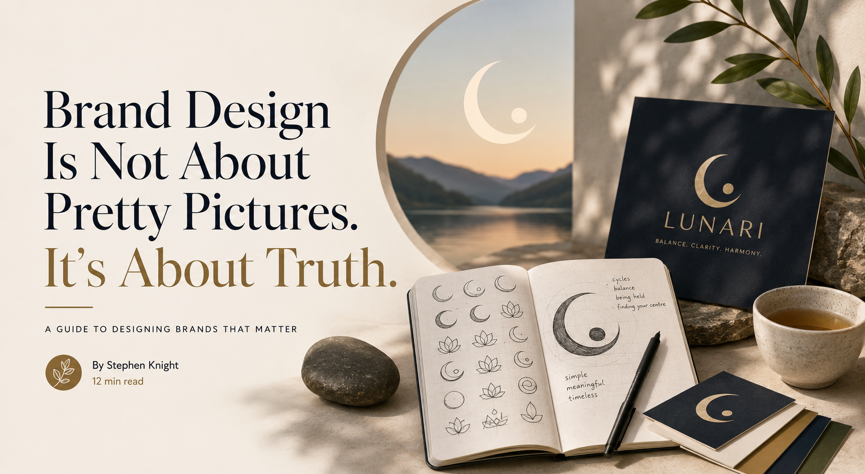
I filled pages in a notebook with terrible drawings. Lotus flowers that curved the wrong way, abstract shapes that led nowhere, moons that looked more like accidents than intentions. But through this apparent chaos, patterns began to emerge.
Through all that mess, one thing kept appearing, a crescent moon holding a small dot. Simple, yes. But in that simplicity was something profound. It spoke of cycles, of being held, of finding your centre. Not because I forced it to mean these things, but because it already did.
You cannot rush this part. You cannot outsource this part. The sketch is where you have your first real conversation with the brand. Everything else is refinement.
Tools in Service of Vision
People often ask about software as if the right program might unlock some secret. But tools are like brushes in an artist's studio, they must be mastered, certainly, but they serve the vision, not the other way around.
Procreate allowed me to refine those hand-drawn elements. Illustrator gave them precision and scalability. Figma helped organise the growing system. Each tool had its moment, its purpose, its contribution to the larger harmony.
But the vision, that came from observation, from practice, from the willingness to let the brand reveal itself rather than forcing it into predetermined shapes.
What Lunari Became
After all the questioning, all the sketching, all the refining, Lunari revealed itself:
The logo: That crescent and dot, refined until it could work at any size, in any context. Simple enough for a child to draw, sophisticated enough to carry meaning.
The typography: Poppins-style sans-serif for clarity, a softer serif for warmth. Not trendy but timeless. Not shouty but confident.
The colours: Deep indigo for trust. Warm off-white for openness. Earth gold for life. Each chosen not because they look good together, but because they mean something together.
I applied this language across touchpoints, packaging, digital interfaces, brand communication. Not to show off technical skills, but to prove the system worked.
What This Taught Me
Most people don't want the truth about branding. They want the myth. They want to believe it's about inspiration and creativity and artistic vision.
The truth is simpler and harder: it's about discipline. It's about asking better questions. It's about having the courage to reject the easy answer and find the right answer.
Every decision must serve the truth of what the brand is. Not what you want it to be. Not what the market expects it to be. What it actually is.
Simple is not easy. Simple is the hardest thing in the world. You must strip away everything that is not essential until only the truth remains.
The Path Forward
If you want to design brands that matter, stop looking at other brands. Look at life. Look at nature. Look at the things that have endured for centuries, not the things that trend for months.
Start with questions, not answers. Why does this brand exist? What truth is it trying to tell? How can it serve the people who encounter it?
Sketch with your hands, not your computer. Let the idea find its natural form before you refine it into pixels and vectors.
Brand design, at its heart, is about translation. We take the intangible, values, emotions, aspirations, and give them form that others can see, touch, experience. Like water finding its way to the sea, the right solution has a quality of inevitability about it. Your job is not to force the river, but to clear the path.